28/03/2025
How to Design for a Seamless Multi-Device Experience
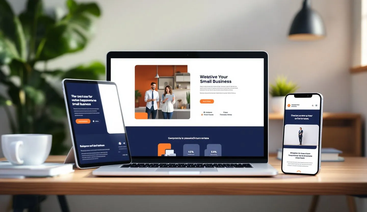
Creating Consistency Across All Screens
In today’s digital landscape, users expect a seamless experience across all their devices—from smartphones and tablets to laptops and desktops. Designing for a multi-device world is no longer a luxury; it’s a necessity. With the rise of remote work, on-the-go browsing, and smart home ecosystems, consistency in design is crucial for usability and brand trust. But how exactly do you ensure that your design adapts effectively across platforms? What key principles should guide your process, and what tools can help you get there? This blog breaks down the strategy and execution of designing for a truly unified multi-device experience.

Understanding User Behavior Across Devices
Users interact with websites differently depending on the device they’re using. For example, mobile users often seek quick information or make on-the-go purchases, while desktop users may be more engaged in research or deep browsing. Understanding these behavioral differences is key to designing experiences that feel natural across devices. Use analytics tools like Google Analytics or Hotjar to track device usage and user flows. Segment your audience by device type to identify friction points in the user journey. Tailoring your content and layout to match user intent on each device greatly enhances usability. Ultimately, a user-centric approach ensures higher satisfaction and engagement.
Responsive vs. Adaptive Design
When designing for multiple devices, understanding the difference between responsive and adaptive design is essential. Responsive design uses flexible grids and media queries to automatically adjust content to the screen size. It’s a fluid, scalable approach suitable for most modern websites. Adaptive design, on the other hand, uses predefined layouts for specific device sizes. It allows for more control but requires more effort to implement. Responsive design is generally recommended for its simplicity and scalability. However, adaptive design can be useful for high-performance apps or content with strict layout needs. Choose the method that best aligns with your goals and resources.
Design Systems and Component Reusability
A design system is your best friend when aiming for consistency across devices. It includes standardized UI components, typography rules, spacing, and color palettes. By reusing components like buttons, modals, and cards, you ensure a cohesive look and feel. Tools like Figma and Storybook make it easier to maintain and scale these systems. Reusable components also speed up development and reduce errors. Establishing clear documentation for your design system is critical for cross-functional teams. This approach not only enhances visual consistency but also improves accessibility and performance across platforms.
Prioritizing Performance and Speed
A seamless experience is only possible when performance is optimized. Mobile users especially are sensitive to slow-loading pages. Compress images, use lazy loading, and implement caching strategies to improve load times. Tools like Lighthouse or WebPageTest can help audit performance metrics. Minimize the use of heavy scripts and third-party plugins. Use scalable vector graphics (SVGs) where possible to reduce file sizes. A fast site not only improves user satisfaction but also boosts SEO rankings, making it a win-win.
Navigation That Works Everywhere
Navigation is a cornerstone of user experience, and it must adapt fluidly across devices. On desktop, users expect visible navigation bars, while on mobile, a hamburger menu or bottom navigation is more intuitive. Maintain a clear hierarchy and ensure that key actions are easily accessible. Avoid hiding essential functions behind too many taps or clicks. Consider using sticky navigation for better usability on long-scroll pages. Consistency in naming and placement builds user familiarity regardless of the device. Test your navigation flow on various screen sizes to uncover potential usability issues.

Touch-Friendly and Accessible Design
Multi-device design must be inclusive and touch-friendly. Ensure tap targets are at least 48 pixels wide, and use adequate spacing to prevent accidental clicks. Support gesture-based interactions where applicable, like swiping or pinching. Use contrasting colors for readability and avoid relying solely on color to convey meaning. Implement ARIA (Accessible Rich Internet Applications) attributes to enhance screen reader compatibility. Accessibility improves usability for everyone, not just users with disabilities. Prioritizing accessibility also aligns with legal compliance in many regions, protecting your brand and expanding your audience.
Testing and Iteration Across Devices
Regular testing is essential to ensure your design works well across all devices. Use cross-browser and cross-device testing tools like BrowserStack or LambdaTest. Don’t rely solely on simulators—test on real devices when possible. Conduct usability testing with diverse users to gather feedback on layout, navigation, and performance. Make iterative improvements based on this feedback. Track KPIs like bounce rate and time on site segmented by device type. A/B testing can also help determine what layouts or features work best on different screens. Continuous testing ensures your multi-device experience remains seamless and up to date.

Conclusion: Building for the Future, One Screen at a Time
Designing for a seamless multi-device experience is no longer optional—it's a competitive advantage. As users switch between phones, tablets, laptops, and even smart TVs, their expectations for consistency and usability only grow. By understanding user behavior, leveraging responsive or adaptive design, and maintaining consistency through design systems, you set the foundation for cross-platform excellence. Optimizing for performance, accessibility, and intuitive navigation ensures that your digital product performs reliably on any screen. Through continuous testing and iteration, you refine the experience further and adapt to evolving user needs.
Whether you're a startup, a small business, or a large enterprise, the principles of seamless multi-device design apply universally. In a world where attention spans are short and competition is fierce, delivering a smooth, engaging experience across all devices can be the difference between bounce and conversion. Investing in thoughtful, user-centric design pays off through higher engagement, stronger brand loyalty, and better business outcomes. Remember, your users don’t care about the complexity behind the scenes—they only care that it works. And when it does, they’ll keep coming back.

16/12/2024
Mai Le

04/11/2024
Mai Le
