31/01/2025
Why Consistency is Key in Visual Branding
Setting the Foundation for Trust and Recognition
In a world flooded with choices, brands have mere seconds to make a lasting impression. Visual branding plays a pivotal role in how audiences perceive and remember a company. But what truly separates memorable brands from forgettable ones is consistency. Consistency in visual branding ensures that your audience can instantly recognize your content, no matter where it's encountered. It reinforces your identity, builds trust, and creates a seamless brand experience. Without it, even the most creative designs can fall flat.
When visual elements like logos, colors, typography, and imagery remain uniform across platforms, they create a cohesive narrative that strengthens brand recall. Think of iconic brands like Nike or Apple—their visual language is unmistakable because it’s consistently applied across every touchpoint. This kind of uniformity is not just aesthetic; it’s strategic. It helps audiences form emotional connections and trust relationships over time. Inconsistent visuals, on the other hand, confuse potential customers and dilute brand identity. That’s why visual consistency isn’t just a design principle—it’s a business imperative. Let’s explore how and why it matters.

Why Visual Consistency Matters
Visual consistency is more than just using the same colors or fonts—it’s about building a recognizable and reliable identity. When your brand looks and feels the same across websites, social media, packaging, and print, it becomes easier for consumers to identify and trust you. This trust translates into brand loyalty, customer retention, and increased sales. Studies show that consistent branding can increase revenue by up to 23%. When people know what to expect visually, they feel a sense of familiarity and comfort. That’s the power of design done right. Consistency makes your brand memorable and sets you apart in a saturated market.
Building Trust Through Repetition
Trust isn’t built overnight—it’s earned through repeated, positive experiences. Visual branding contributes to this by reinforcing expectations. When your audience sees the same logo style, color scheme, and design language over and over, it affirms that your brand is dependable. This is why successful brands invest heavily in standardized visual systems. From social media posts to email newsletters, every asset should reflect the same visual tone. This repetition strengthens brand identity and assures customers they’re interacting with the same brand, no matter the platform. Over time, these small moments of visual recognition build an emotional connection that drives loyalty.

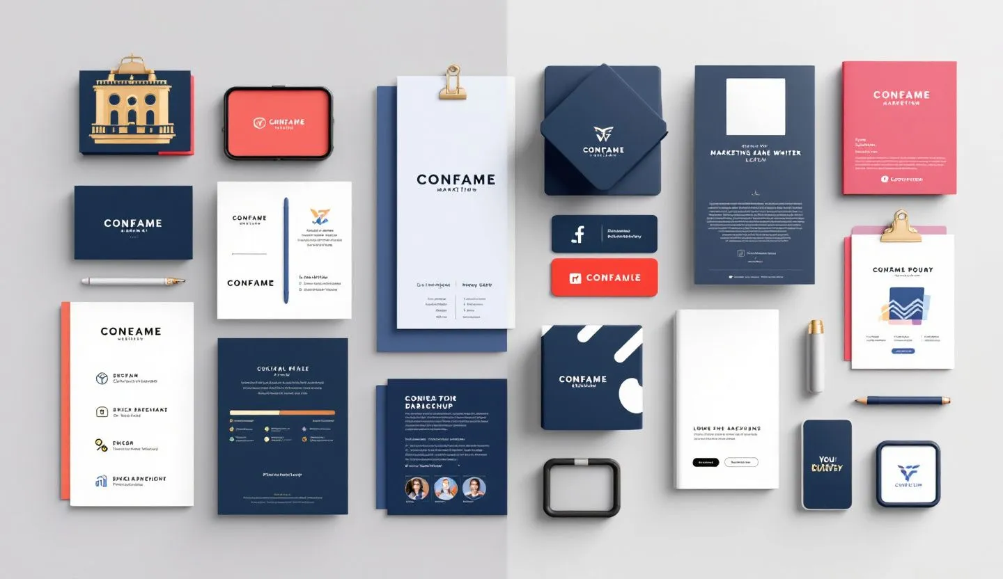
Essential Elements to Keep Consistent
- Logo – Maintain consistent size, spacing, and positioning.
- Color palette – Use brand-approved colors across all assets.
- Typography – Stick to a set of fonts and hierarchy rules.
- Imagery – Use photography or illustrations with a similar style and tone.
- Layout – Apply consistent grid systems and spacing rules.
Case Study: Coca-Cola's Visual Legacy
One of the best examples of visual consistency is Coca-Cola. Despite evolving trends and markets, the brand has maintained a signature red color, Spencerian script logo, and classic imagery for over a century. These visual constants have made Coca-Cola instantly recognizable in over 200 countries. Whether on a billboard in Tokyo or a vending machine in New York, the brand’s identity remains unmistakably cohesive. That consistency reinforces its message of joy and refreshment globally. It shows that even as messaging evolves, visual branding can remain a steady anchor. This case illustrates how visual consistency sustains brand equity over decades.
Aligning Teams Through Brand Guidelines
To maintain visual consistency, internal alignment is key. Brand style guides serve as the blueprint for how your brand should appear in every context. These documents outline everything from font usage to logo placement and tone of voice. When teams across marketing, design, and product follow the same rules, output becomes uniform and professional. Without guidelines, your brand risks looking fragmented or amateurish. A well-crafted brand manual ensures that even external collaborators maintain your visual identity. It’s the glue that holds your branding together, ensuring every piece of content reflects your core identity.

Avoiding the Pitfalls of Inconsistency
Inconsistent branding can lead to confusion, mistrust, and lost sales. Imagine receiving an email from a brand that looks nothing like its website—would you trust it? Mismatched visuals can signal disorganization or even fraud. Additionally, inconsistency weakens your brand recall, making it harder for customers to recognize you. This becomes especially problematic in competitive markets. When a brand’s identity shifts unpredictably, it breaks the mental connection audiences have built. The solution? Establish strict visual guidelines and audit your content regularly to ensure cohesion across the board.
Consistency in Multi-Channel Campaigns
Today’s brands operate across dozens of touchpoints—social media, email, packaging, websites, and digital ads. Maintaining visual consistency across these channels ensures a unified customer experience. Whether someone first sees your brand on Instagram or a billboard, the design language should be immediately recognizable. Tools like digital asset managers and brand kits help teams stay aligned. Additionally, automated design systems can reduce human error and uphold standards. Multi-channel consistency ensures your message isn't diluted or misunderstood. In a fragmented digital landscape, visual unity is a competitive advantage.
Conclusion: Design with Intention, Deliver with Consistency
Visual branding is more than just aesthetics—it’s about communication, emotion, and perception. Consistency ensures that communication is clear and compelling, no matter where it appears. It tells your audience that you’re reliable, professional, and worth remembering. By maintaining a unified visual identity, you create a sense of familiarity that fosters trust and builds loyalty. In an era where attention is fleeting, consistency helps your brand stand out and stay relevant. It allows you to craft a story that resonates with your audience repeatedly and reliably.
As you scale your brand, the effort you put into maintaining visual consistency will pay off exponentially. It enhances customer experience, strengthens internal alignment, and increases your brand’s perceived value. Whether you’re a startup or an established business, investing in consistent visual branding is one of the smartest moves you can make. It’s not just about looking good—it’s about being remembered and trusted. So, build your brand guidelines, educate your teams, and commit to consistency. Because in branding, repetition isn’t redundancy—it’s recognition.

02/02/2025
Kristen

28/06/2024
Sayan Bhattacharyya
